Redesigning an Information-Dense Platform — Making Underground Airflow Data Reliable

Time

2-week design sprint

Role

Product Designer

Team

2 Designers

1 Stakeholder

Focus

UX Research

UI Design

Brand Design

Design System

Overview

Research

Ideation

Iteration

Final Product

Reflection

Overview

PlusQ is a monitoring platform developed by a Chilean startup with a funded pilot, designed to support underground ventilation systems where incorrect interpretation or delayed decisions can directly impact worker safety.

The existing platform was originally built as a technical demo, intended to showcase system capabilities rather than support real operational use. While the initial stakeholder request focused on improving UX and UI, it became clear early on that the core challenges were both structural and visual. Our redesign therefore focused first on structure and decision clarity, while treating visual quality as a necessary layer to reduce ambiguity, misinterpretation, and perceived risk in a safety-critical environment.

Why Redesign

The original platform suffered from several fundamental issues:

• High information density without clear prioritization

• Disconnected pages and unclear navigation logic

• Weak visual hierarchy, making critical signals hard to identify

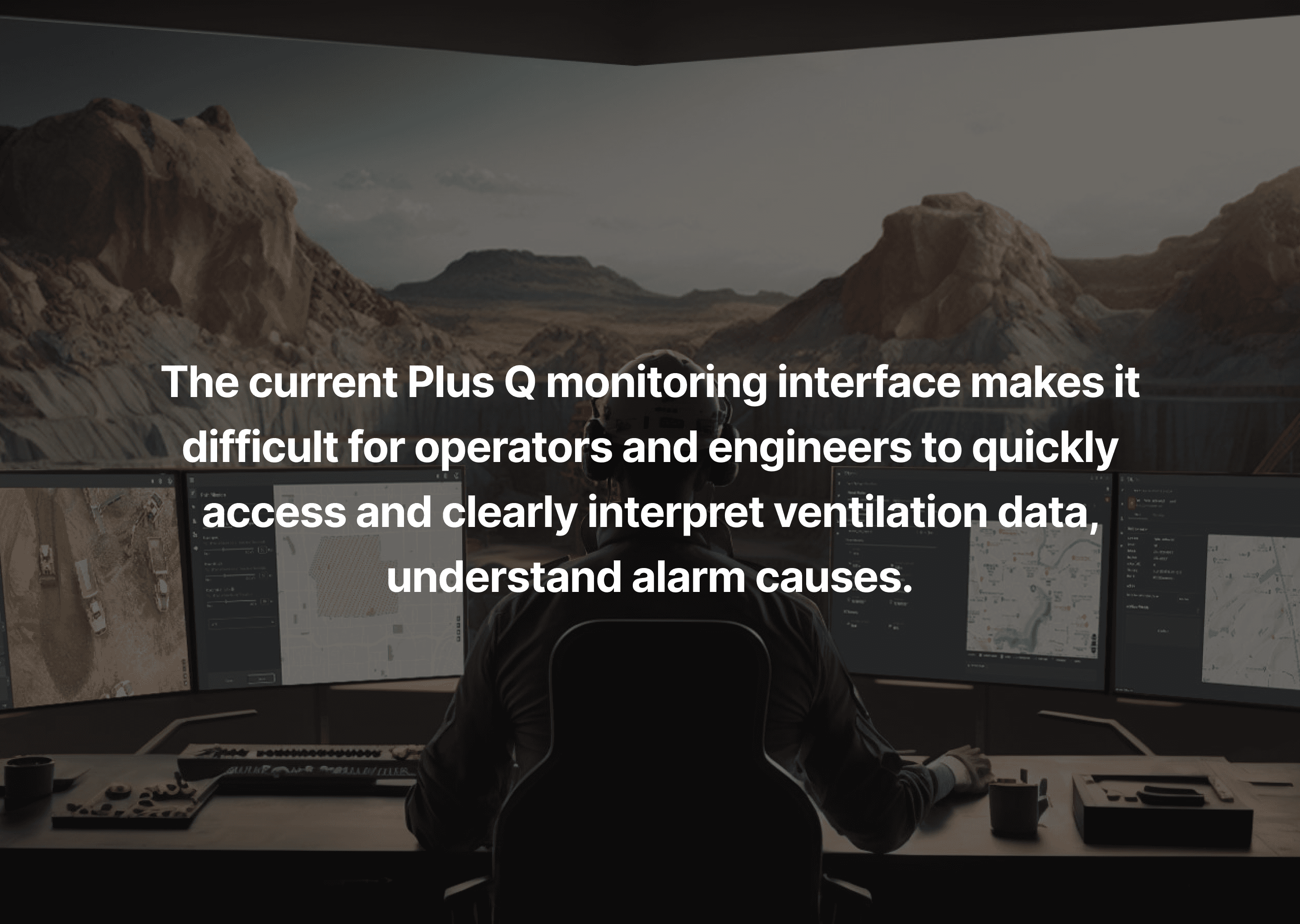
In a safety-critical context, these issues increased cognitive load and the risk of incorrect decisions. Improving surface-level UI alone would not be sufficient without rethinking how information was structured, surfaced, and accessed.

Constraints

• No real users were actively using the platform yet

• The system existed only as a technical demo

• The domain was highly technical and unfamiliar

• Documentation and terminology were fragmented

• The timeline was limited to a two-week sprint

Problem Framing

“Underground ventilation isn’t just a technical issue, it’s about safety.”

When Daniel, the stakeholder, introduced the platform, our first impression was not technical but human. Ventilation failure underground is not abstract, it directly affects people’s lives. This reframed the project immediately. The goal was not just to “make the UI nicer” or invent new features, but to redesign a system that supports fast, confident decision-making under high risk.

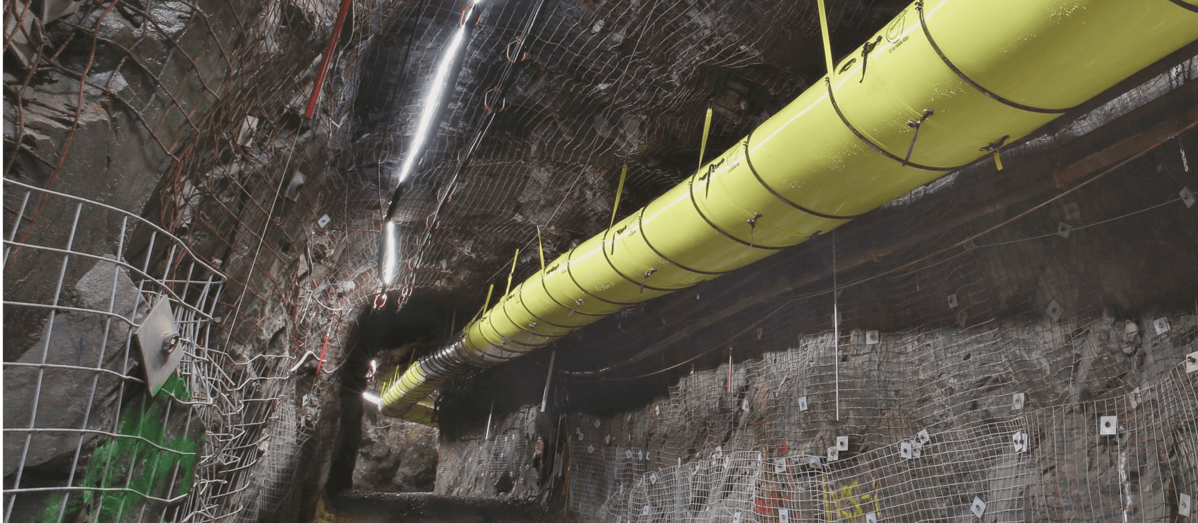
Underground and monitoring room

How platform and ventilation are connected

Approaching a Technical Platform

"As designers, we were the blockers in this project."

In a highly technical domain, understanding the system itself became the first design task. Our level of understanding would directly determine the quality of the solution. This was not a classic zero-to-one design project. Instead, the task was one of translation and validation: understanding roles, responsibilities, and decision pressure, then restructuring the system so its meaning became explicit and trustworthy. This meant the main challenges are learning the domain, mapping system logic, and defining user flows before touching the UI.

Research

Understand the what the system does and also the users behind the screens.

Rather than getting lost in broad desktop research across unfamiliar technical domains, we intentionally limited research scope and focused on roles, workflows, and decision contexts. UX methods helped prevent us from drifting into technical abstraction without user relevance. A constant guiding question was: "Who is responsible for what, and what do they need to see first when it matters?"

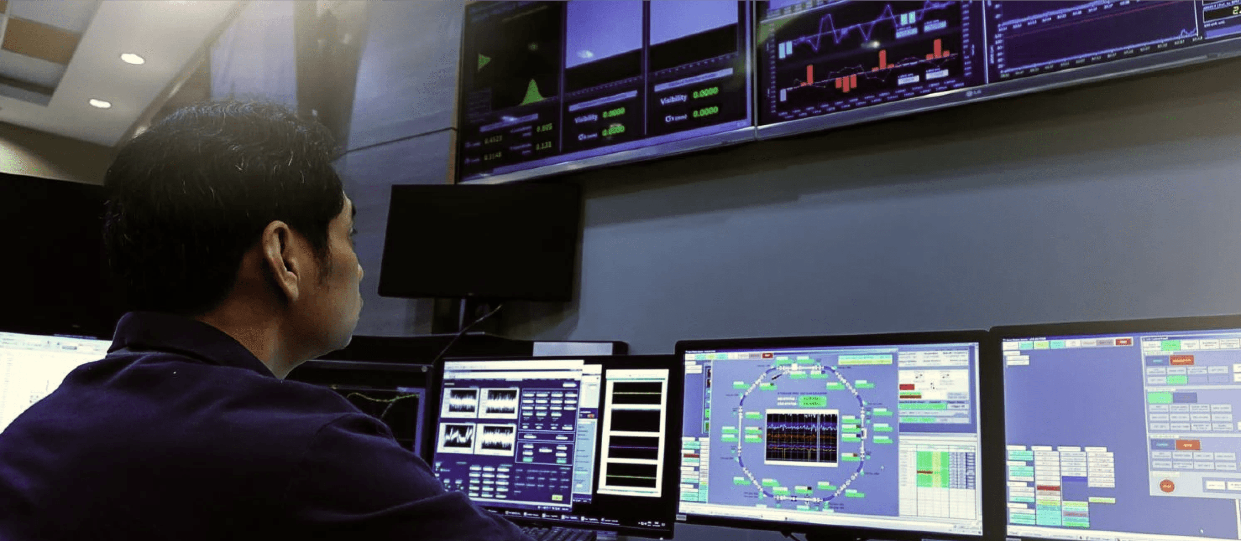
Industry and comparable systems

We reviewed data-dense industrial platforms to understand how hierarchy, urgency, and meaning are communicated under pressure.

Stakeholder walkthroughs

Stakeholder walkthroughs provided raw, technical explanations of the existing system. Mapping the current information architecture was the first step to organize these explanations into an explicit structure. This created a baseline that allowed us to reason about the system and prepare for later restructuring.

Mapped current IA as structural baseline

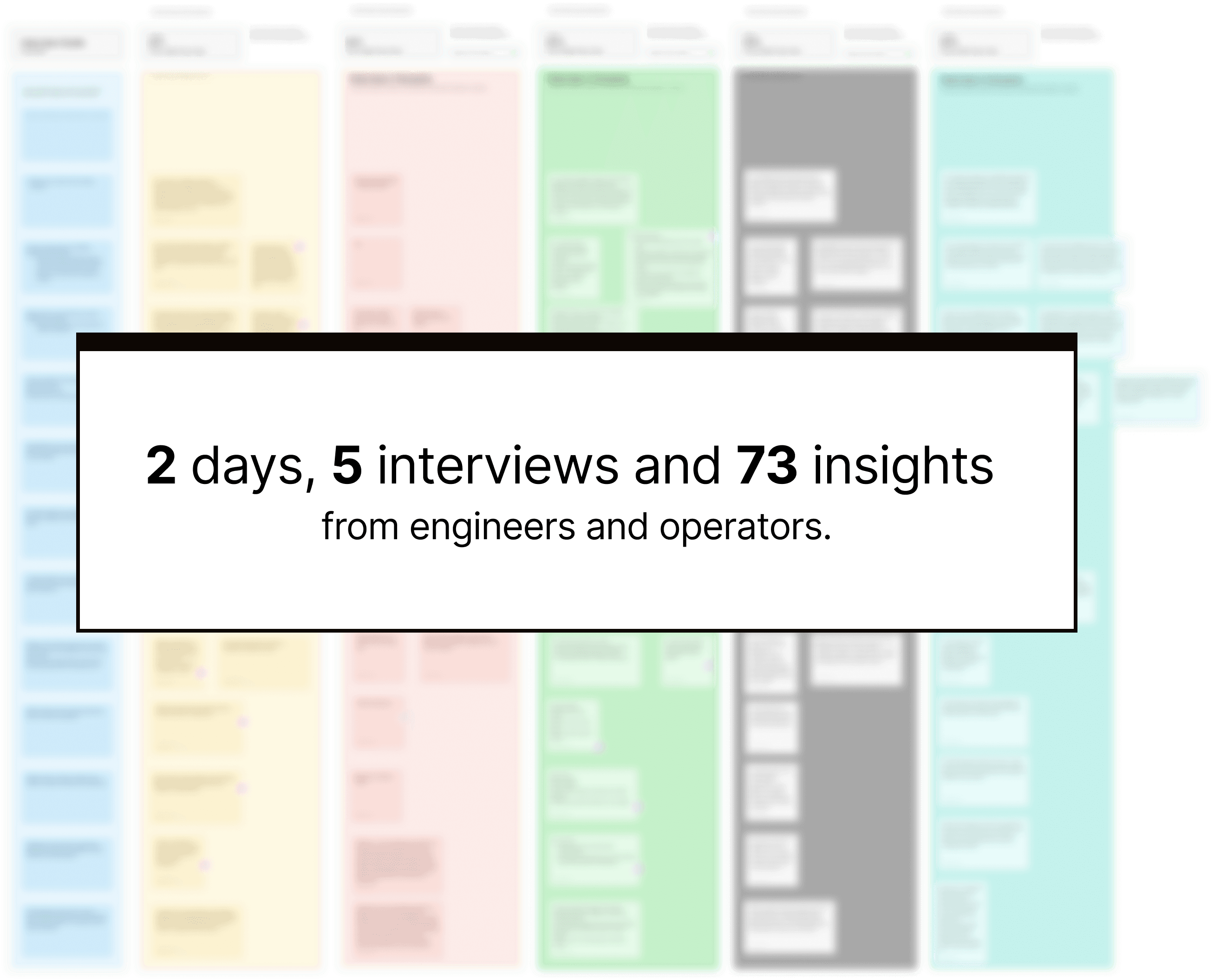
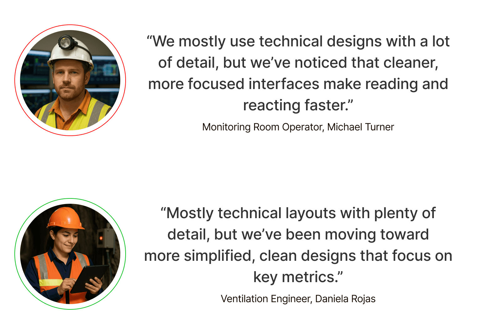
User interviews and personas

We had five interviews focused on daily routines, monitoring versus emergency behavior, confirmation habits, and data preferences. The emphasis was on workflows and decision pressure and visual preferences.

Heuristic analysis

We identified unclear navigation, missing logic between pages, and weak hierarchy directly within the existing interface.
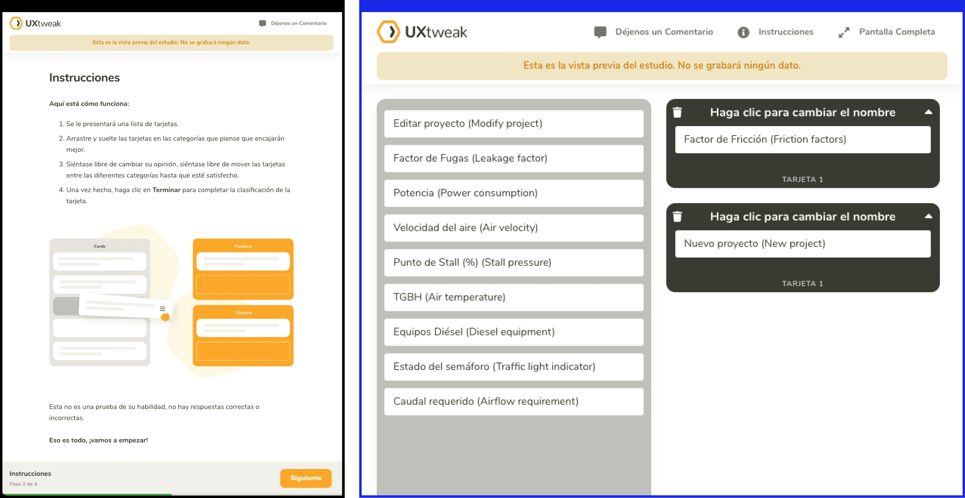
Card sorting

Originally intended to explore how unfamiliar terms and features could be grouped by users. Due to limited participation, the results were not strong enough to serve as a final IA decision. Rather than forcing conclusions, we used the exercise internally to deepen our understanding of key terms, their relationships, and contextual groupings. 

Research Summary

Operators and engineers used the same platform but with fundamentally different goals.

• Operators monitored live data in control rooms, focusing on real-time alerts and overall system status • Engineers configured parameters and analyzed long-term performance trends Personas and journey maps helped clarify these workflows and confirmed that role differences needed to be reflected in structure and navigation before visual refinement.

Design Goals

Refining user flow before touching the UI.

Design Goals

Refining user flow before touching the UI.

Design Goals

Refining user flow before touching the UI.

Goal 1

Always start with flows, not style.

Goal 2

Bringing hidden workflows into clearer visibility.

Goal 3

Modernizing interaction without losing industrial familiarity.

Problem Statement

Problem Statement

Problem Statement

Ideation

With clearer user understanding, I shifted focus to redefining structure and user flows. Given the safety implications, limited domain certainty, and validation cost, I deliberately avoided radical redesigns early on. Instead, I chose step-by-step integration, prioritizing trust and stability before exploration.

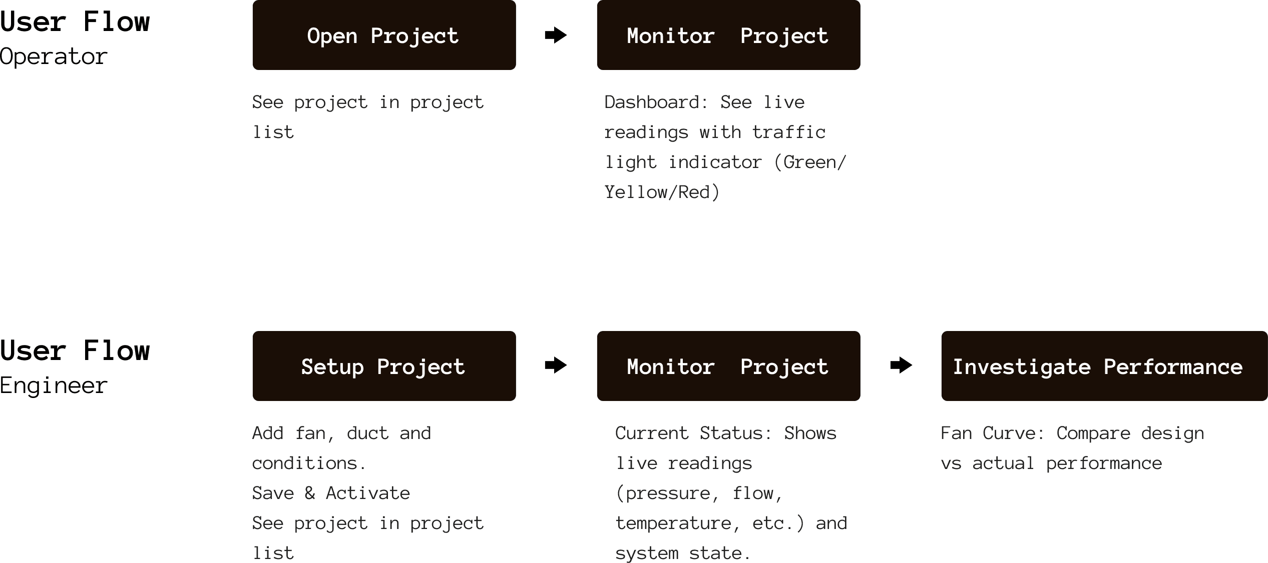
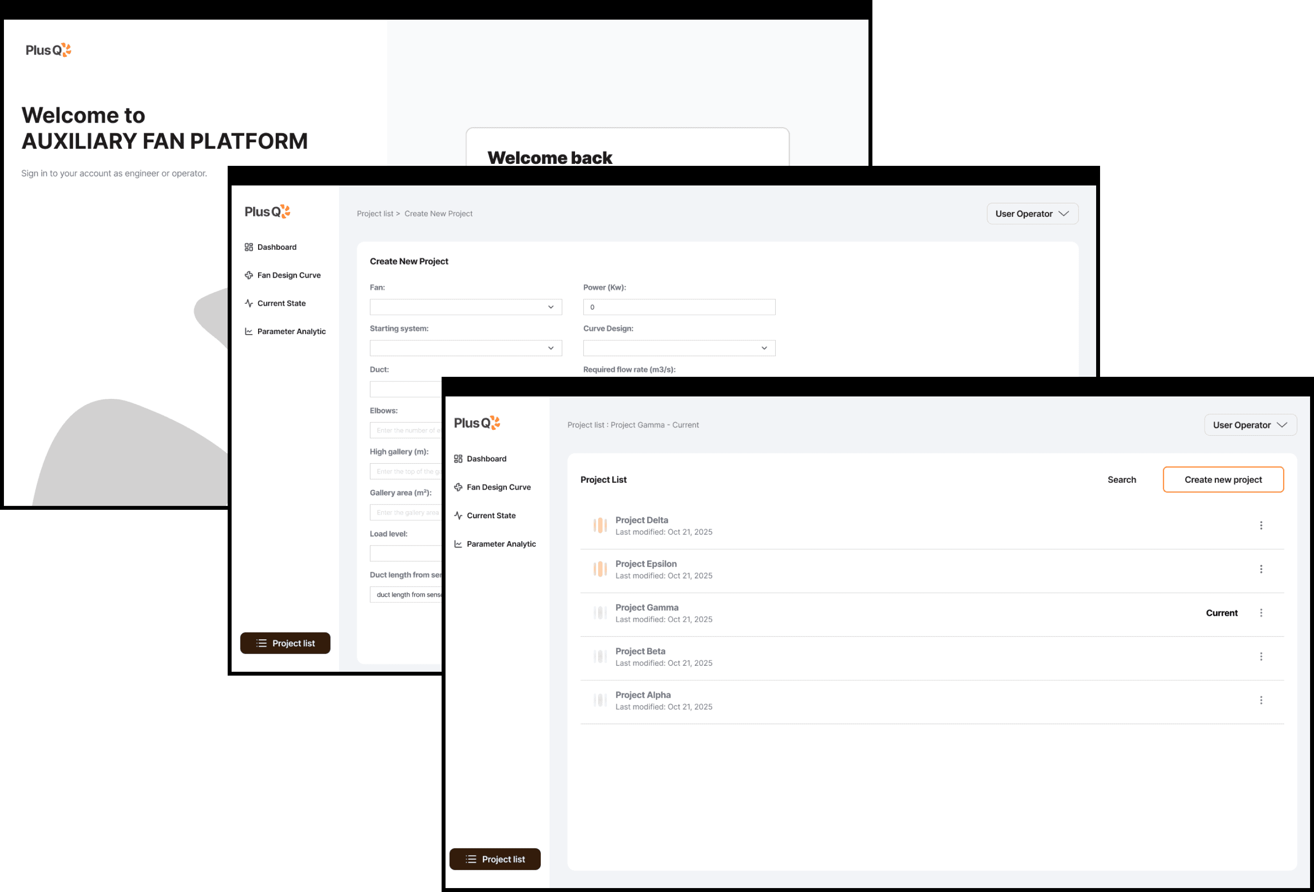
Redesigned User Flows

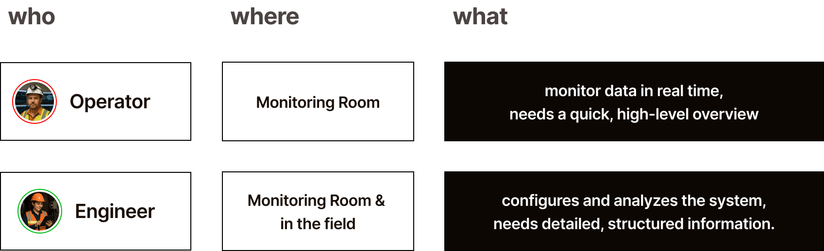
Separate flows were defined for each role:

• Operator dashboards surfaced key signals at a glance

• Engineer views supported structured analysis and configuration

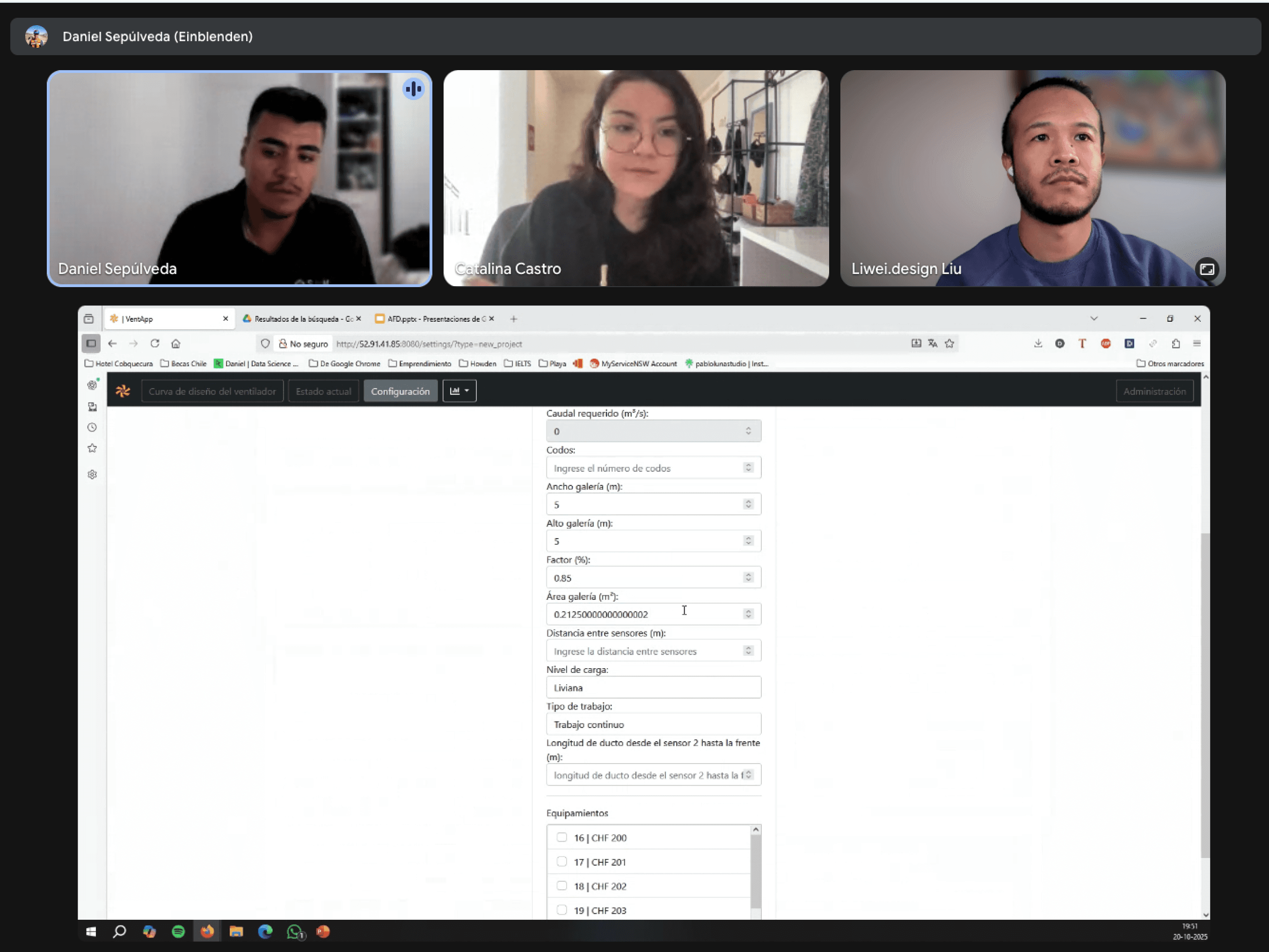
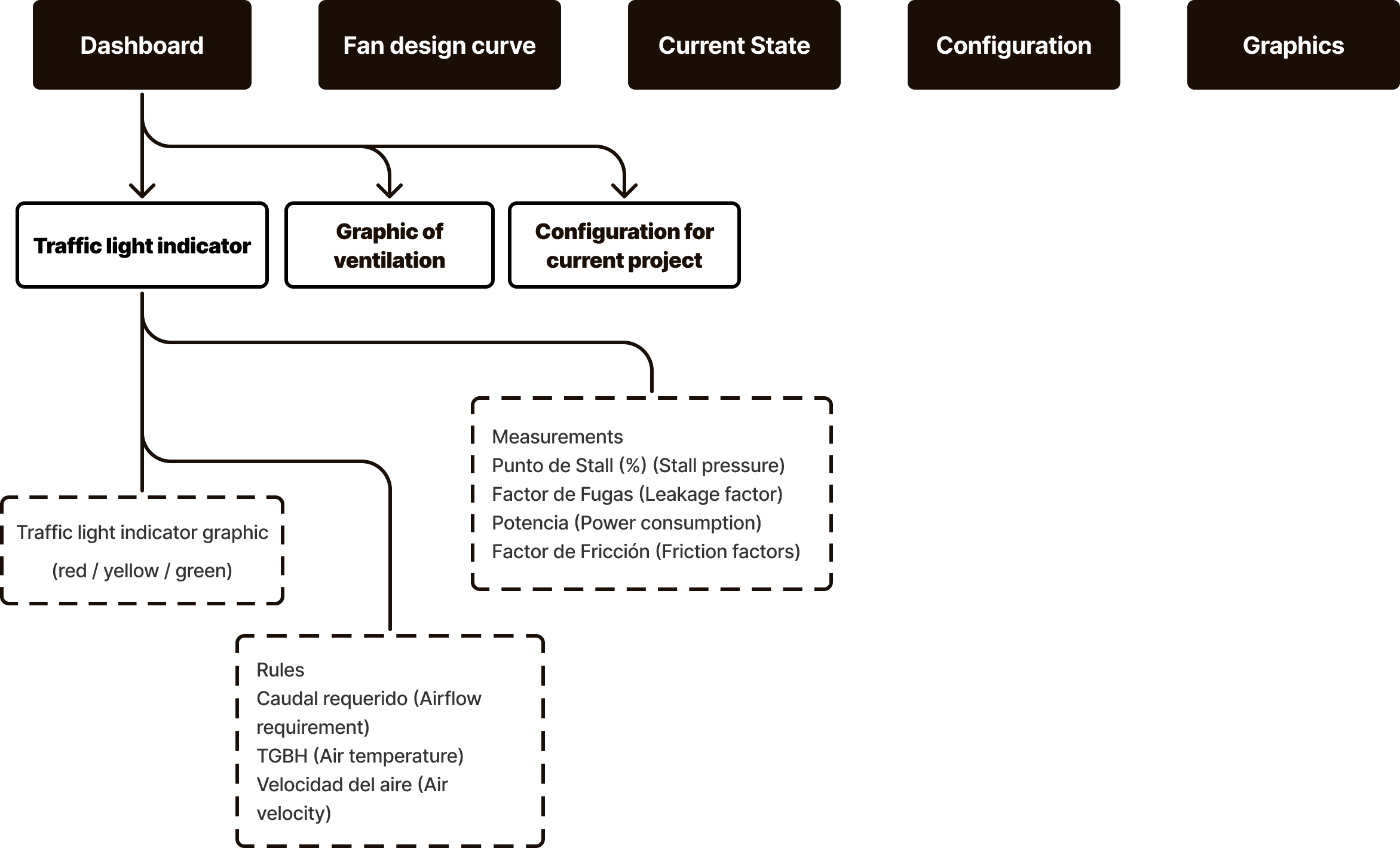
Redesigned Information Architecture

I compared existing pages against these flows and made deliberate decisions about:

• Which pages could remain but required restructuring

• Which workflows were missing or invisible

• Which elements were core versus secondary

This resulted in a coherent information structure that guided users from high-level overviews to detailed analytical screens.

Mid-Fidelity Structuring

To move quickly, I translated existing pages into mid-fidelity layouts using simple structural components. Some sections reused screenshots or incomplete data intentionally, the goal was not completeness, but creating a shared structure that could be discussed and validated. Throughout this process, I consistently asked: • Who is using this page? • What should capture attention first? • When are additional details required? These questions guided design decisions and stakeholder conversations. Feedback confirmed that the new hierarchy significantly improved navigation and comprehension.

Mid-fi draft with Figma Make

Tools such as Figma Make helped accelerate this process, allowing me to rebuild screens rapidly and focus on hierarchy and flow rather than layout polish.

Iteration

Early iterations focused on validating structure rather than polish. Once alignment was reached, I moved toward more cohesive components and visual consistency.

Iteration

Early iterations focused on validating structure rather than polish. Once alignment was reached, I moved toward more cohesive components and visual consistency.

Iteration

Early iterations focused on validating structure rather than polish. Once alignment was reached, I moved toward more cohesive components and visual consistency.

Stakeholder collaboration

Iteration happened through annotated PDFs, page-by-page walkthroughs, and confirmation loops. Sequencing changes gradually helped build trust and avoided surprises.

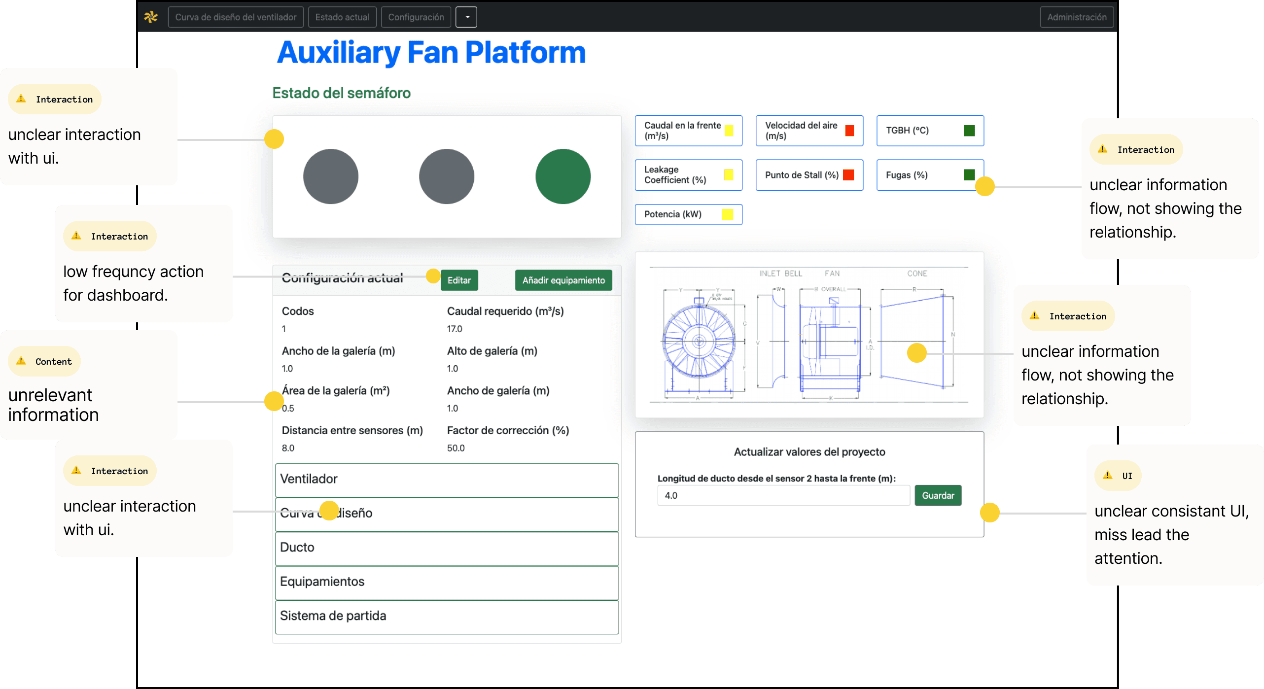
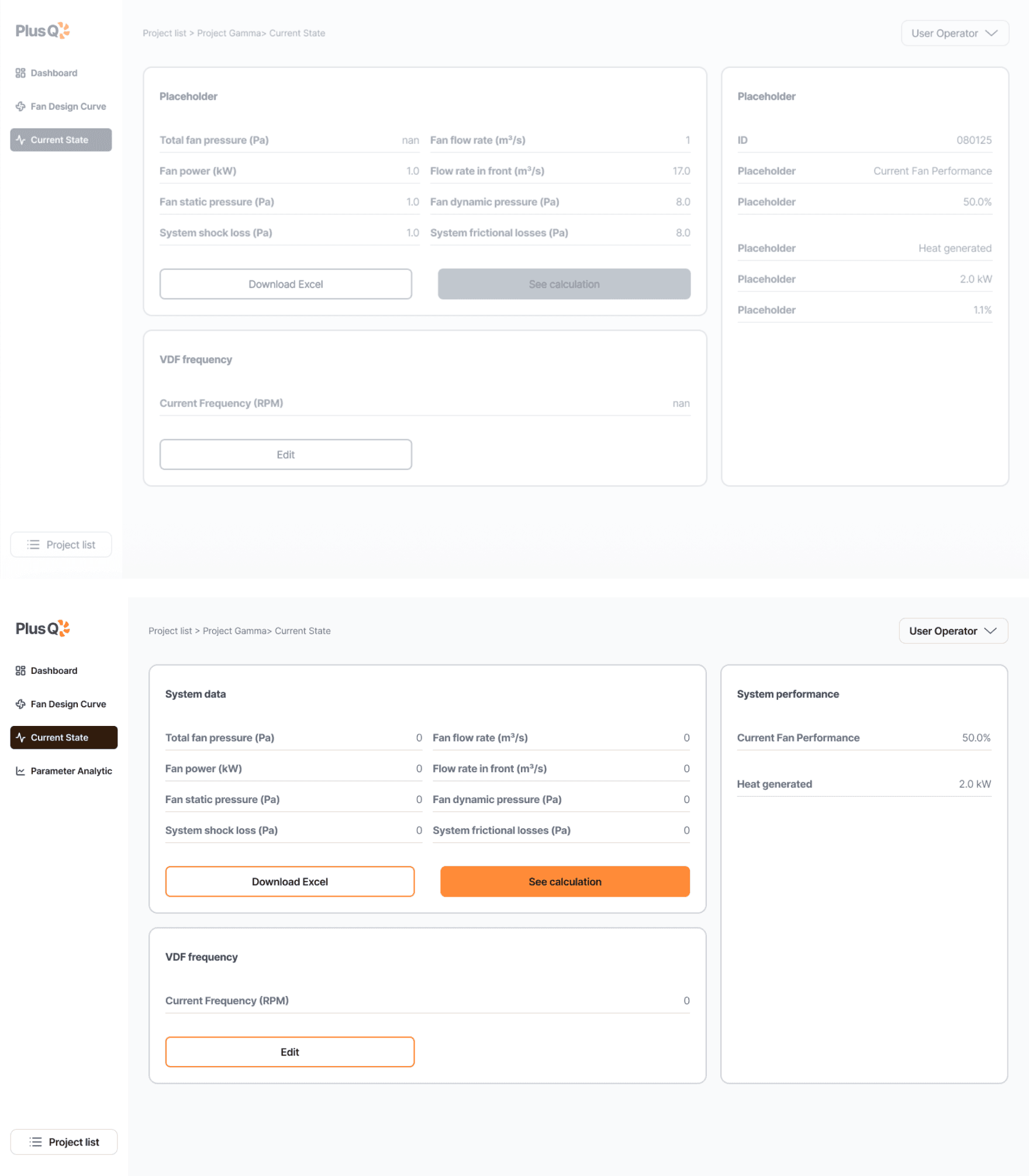
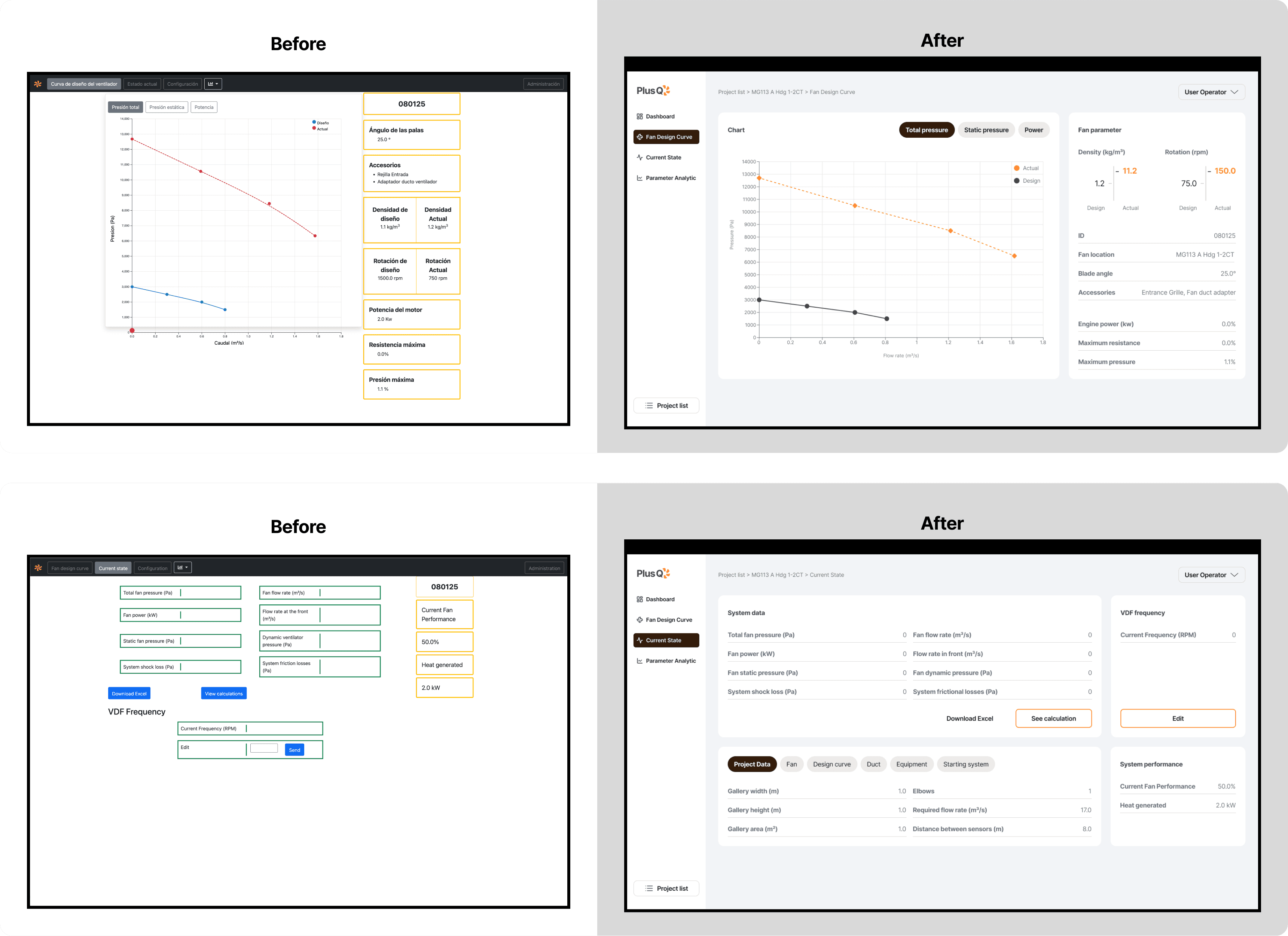
Reducing information overload

• Dropdown-heavy layouts were replaced with tab systems when overview mattered more than parallel comparison

• Read & write system data was clearly separated from edit actions

• Data was grouped consistently by function, origin, and relationship

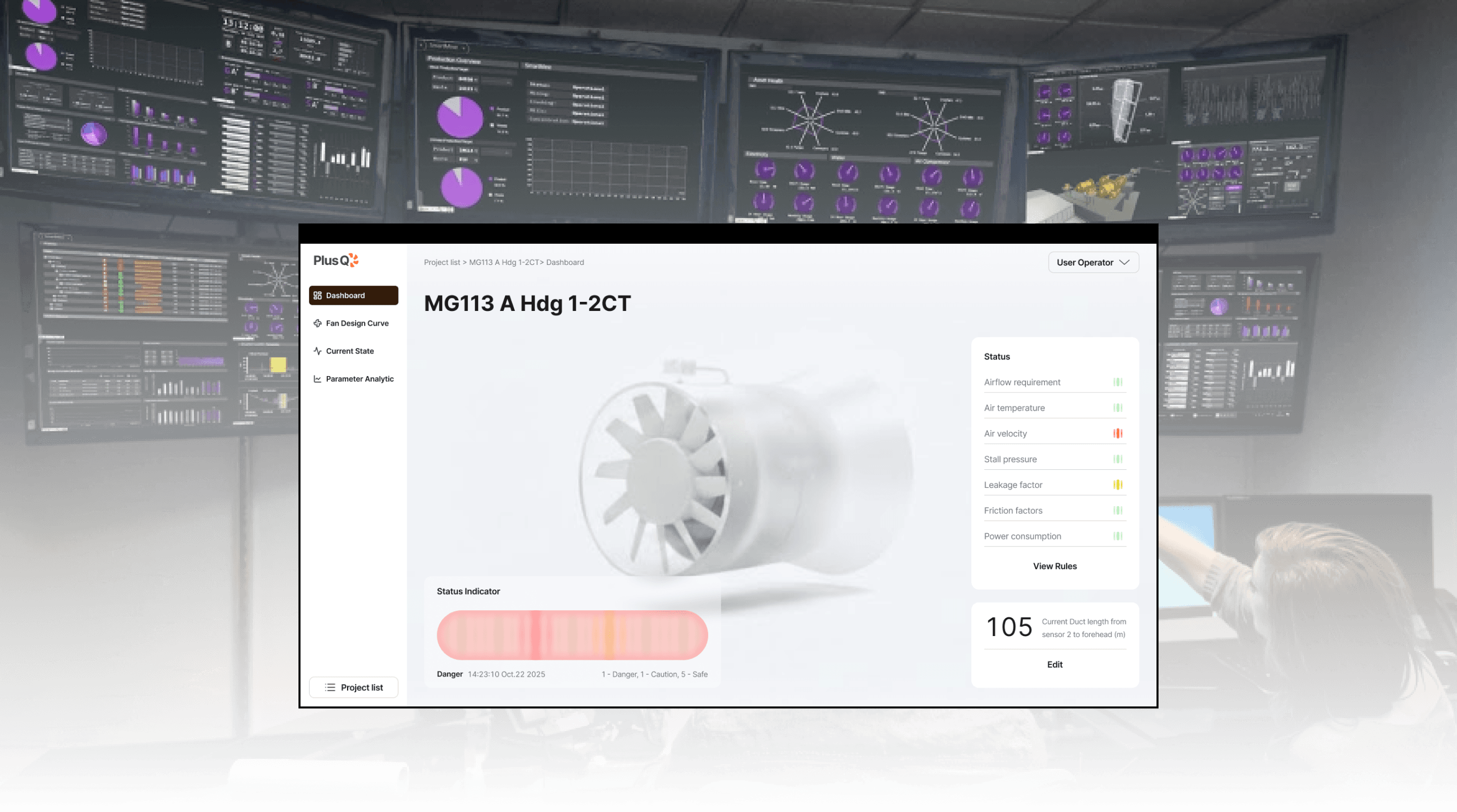
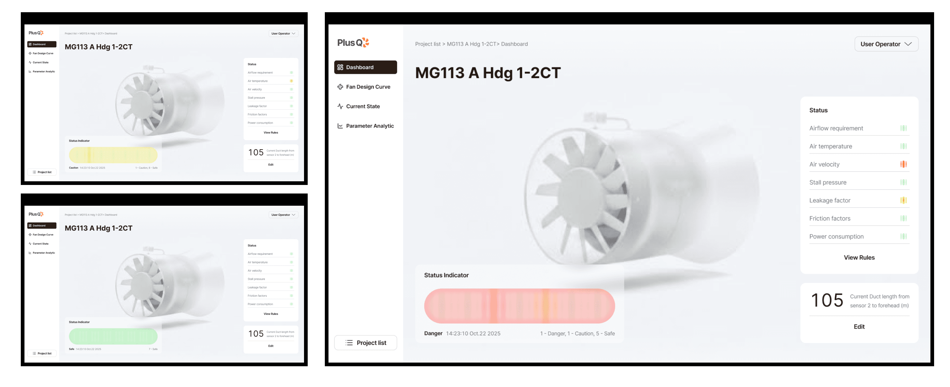
3D ventilation visualization

A dense technical diagram was replaced with a cleaner 3D-effect visualization. This reduced noise, improved immediate comprehension, and created visual breathing room on the dashboard.

Traffic-light system

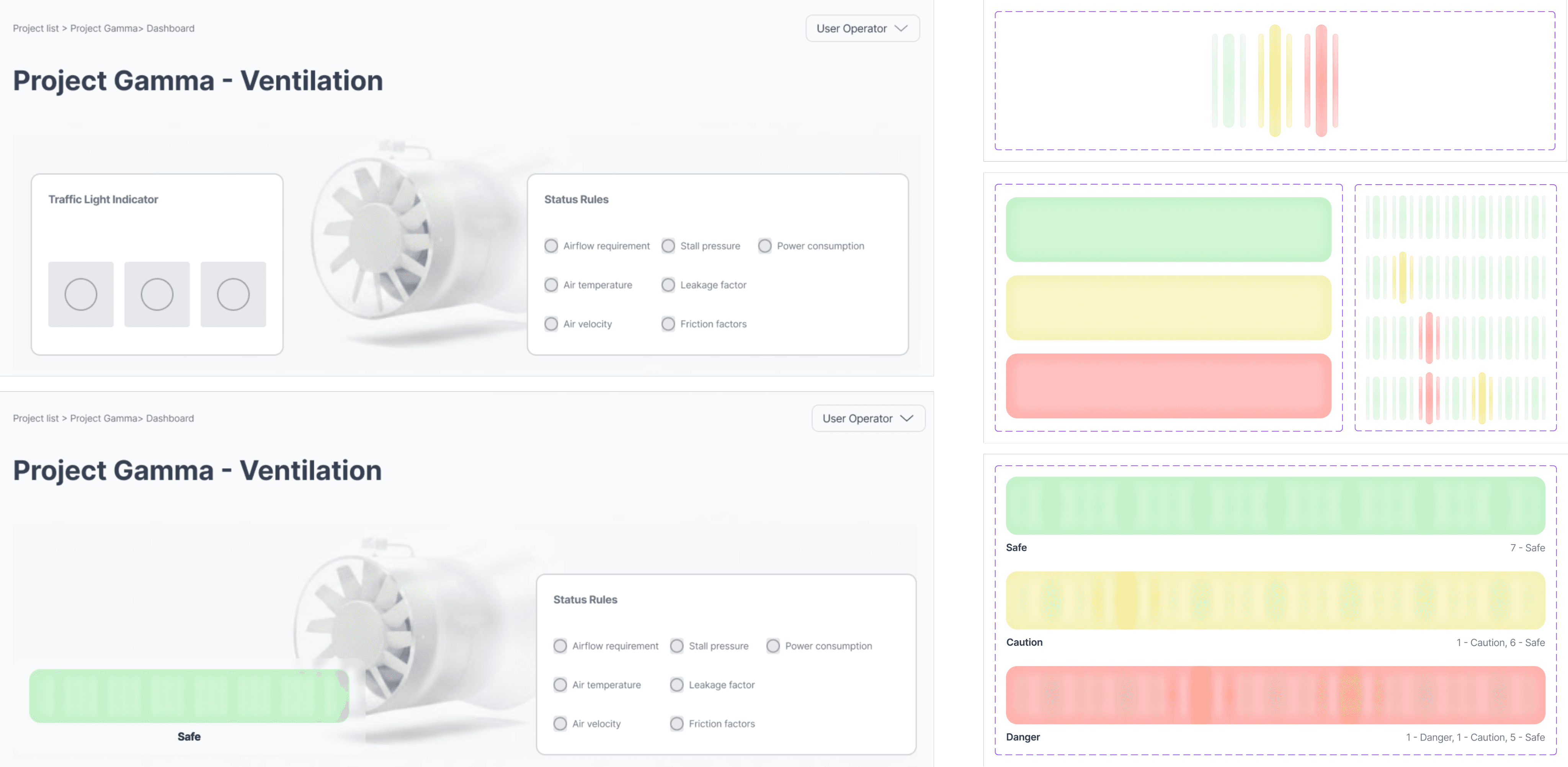
I reworked the existing traffic-light concept into a clearer indicator system. Multiple signals feed into one overall status, while still showing counts of warnings and errors, combining summary with severity.

Text refinement

Titles were shortened, abbreviations clarified, and terminology confirmed with stakeholders.

Brand and Style Guide

Once feedback shifted from structure to details such as spacing, typography, and contrast, an accent color was introduced. It was used as a hierarchy tool rather than decoration, reinforcing clarity and perceived stability.

Dashboard reorganization

Instead of making extreme changes at the first draft, elements were removed or relocated continuously. This approach helped the stakeholders to understand the direction, leading to stronger collaboration and clearer prioritisation.

Final Design

The PlusQ redesign clarified navigation, aligned user priorities, and modernized the visual language while preserving the professional tone expected in industrial software.

Final Design

The PlusQ redesign clarified navigation, aligned user priorities, and modernized the visual language while preserving the professional tone expected in industrial software.

Final Design

The PlusQ redesign clarified navigation, aligned user priorities, and modernized the visual language while preserving the professional tone expected in industrial software.

For operators

System status is immediately visible. Traffic-light indicators surface issues without interpretation, and clear drill-down paths lead to underlying rules and details.

For engineers

Project creation and setup flows are explicit. Managing multiple projects is clearer, and technical data is grouped logically for configuration and comparison.

Reflection and Takeaways

This project reinforced a pattern I’ve seen repeatedly in complex systems: clarity is not a visual layer, but a reasoning structure. Working in an unfamiliar technical domain strengthened my confidence navigating uncertainty. Progress came from moving forward while continuously refining understanding, rather than waiting for perfect knowledge. In PlusQ, user interviews helped anchor design decisions and prevented abstraction from overtaking usability. When workflows are clear and responsibilities are explicit, even data-heavy interfaces can become legible, reliable, and safe.

Outcome

Awards from Ironhack Programme 🏅 All-Rounder Excellence – Final Project Award & Hackshow Representative 🏅 Most Credible Research – Final Project Award

Outcome

Awards from Ironhack Programme 🏅 All-Rounder Excellence – Final Project Award & Hackshow Representative 🏅 Most Credible Research – Final Project Award

Outcome

Awards from Ironhack Programme 🏅 All-Rounder Excellence – Final Project Award & Hackshow Representative 🏅 Most Credible Research – Final Project Award

“They spent so much time understanding what the project was about and still managed to complete every stage of testing and improvement. We’re very proud of this final result.”

Tutor
Sarah Bombaywala

“At first, I thought they wouldn’t finish on time, but the results are great. I’m very happy with what they accomplished.”

Stakeholder
Daniel Sepúlveda

Get in touch

Get in touch

Work with Liwei to make your product more thoughtful and easier to use.

Work with Liwei to make your product more thoughtful and easier to use.

Liweiworks

Liweiworks

© liweiworks.com All rights reserved

© liweiworks.com All rights reserved