Giving the energy consumption data a clear logic — Kalo App Redesign
Time
1-week design sprint
Role
Product Designer
Team
Just me
Focus
UX Research
UI Design
Overview
Research
Ideation
Final Product
Reflection
Overview
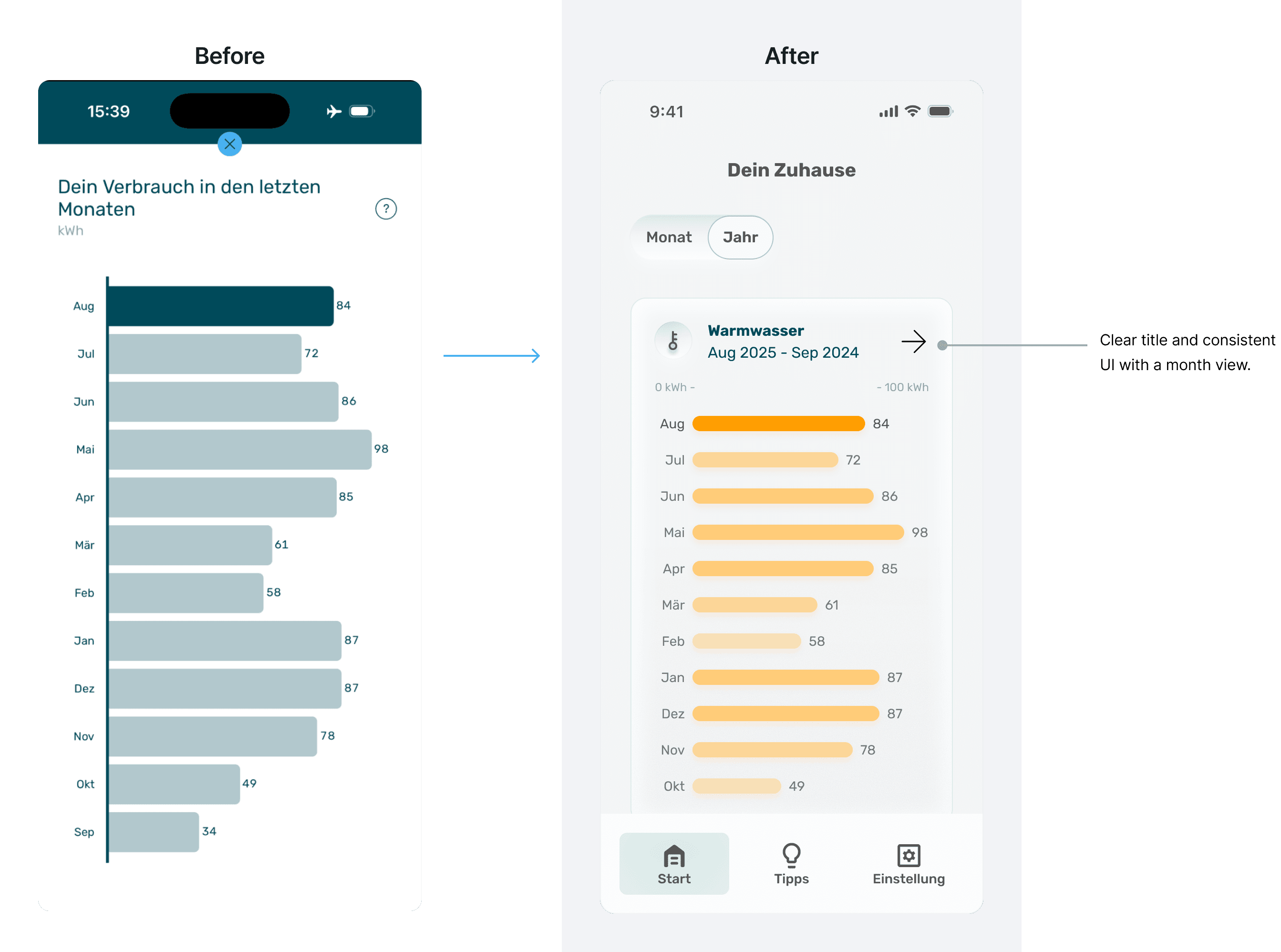
The original experience made it difficult for users to interpret usage patterns, compare data meaningfully, and navigate with confidence.
Kalo App is a customer-facing monitoring service from a German energy provider, offering residents monthly updates on their heating and warm-water consumption. Liwei redesigned the core experience by clarifying navigation, improving interaction logic, restructuring the information architecture, and creating a more consistent visual system.
Overview
The original experience made it difficult for users to interpret usage patterns, compare data meaningfully, and navigate with confidence.
Kalo App is a customer-facing monitoring service from a German energy provider, offering residents monthly updates on their heating and warm-water consumption. Liwei redesigned the core experience by clarifying navigation, improving interaction logic, restructuring the information architecture, and creating a more consistent visual system.
Why Redesign
Why Redesign
Why Redesign
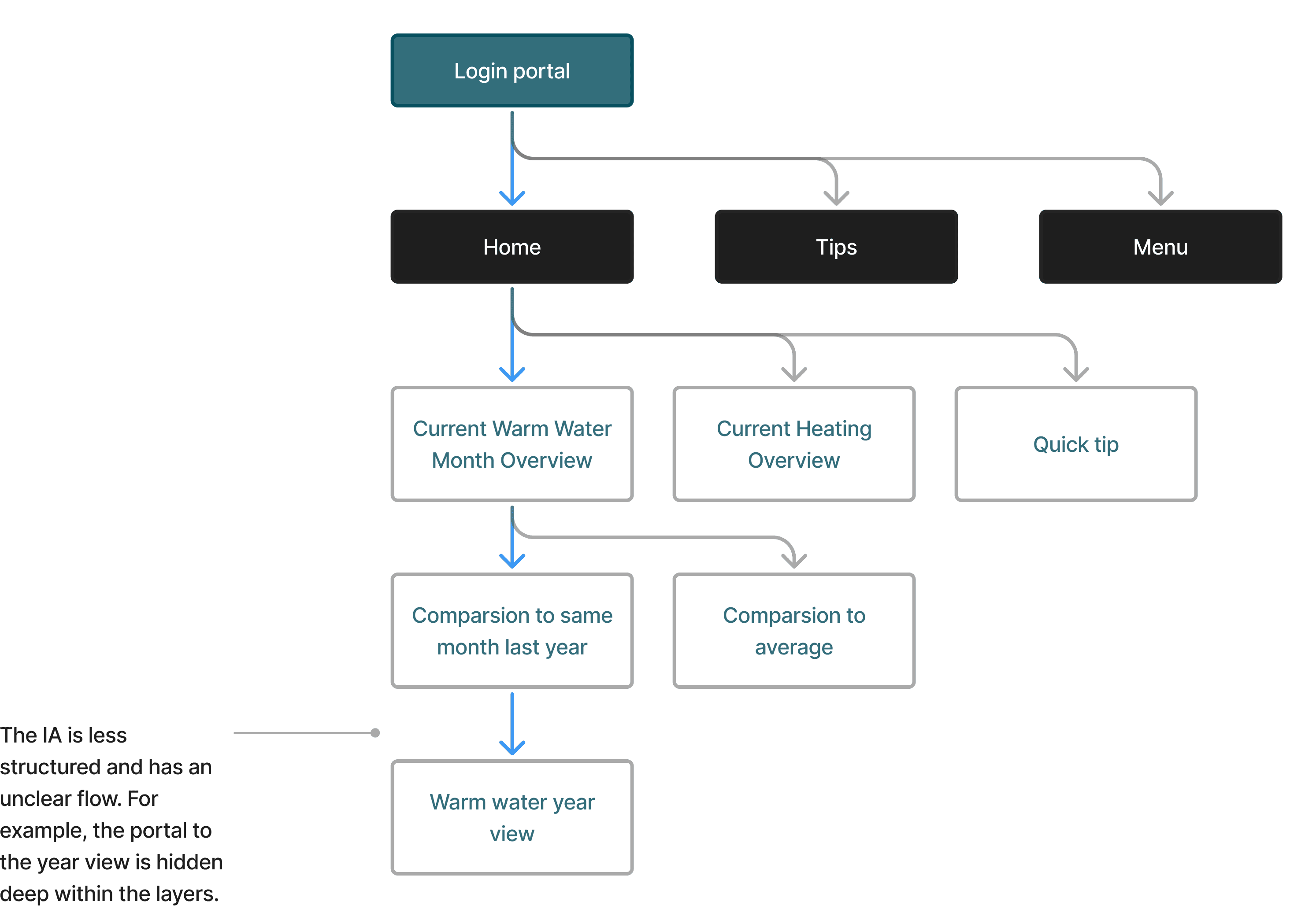
Unclear navigation structure
The app mixed iOS and Android navigation logic, created multiple entry points, and hid key pages inside deep layers.
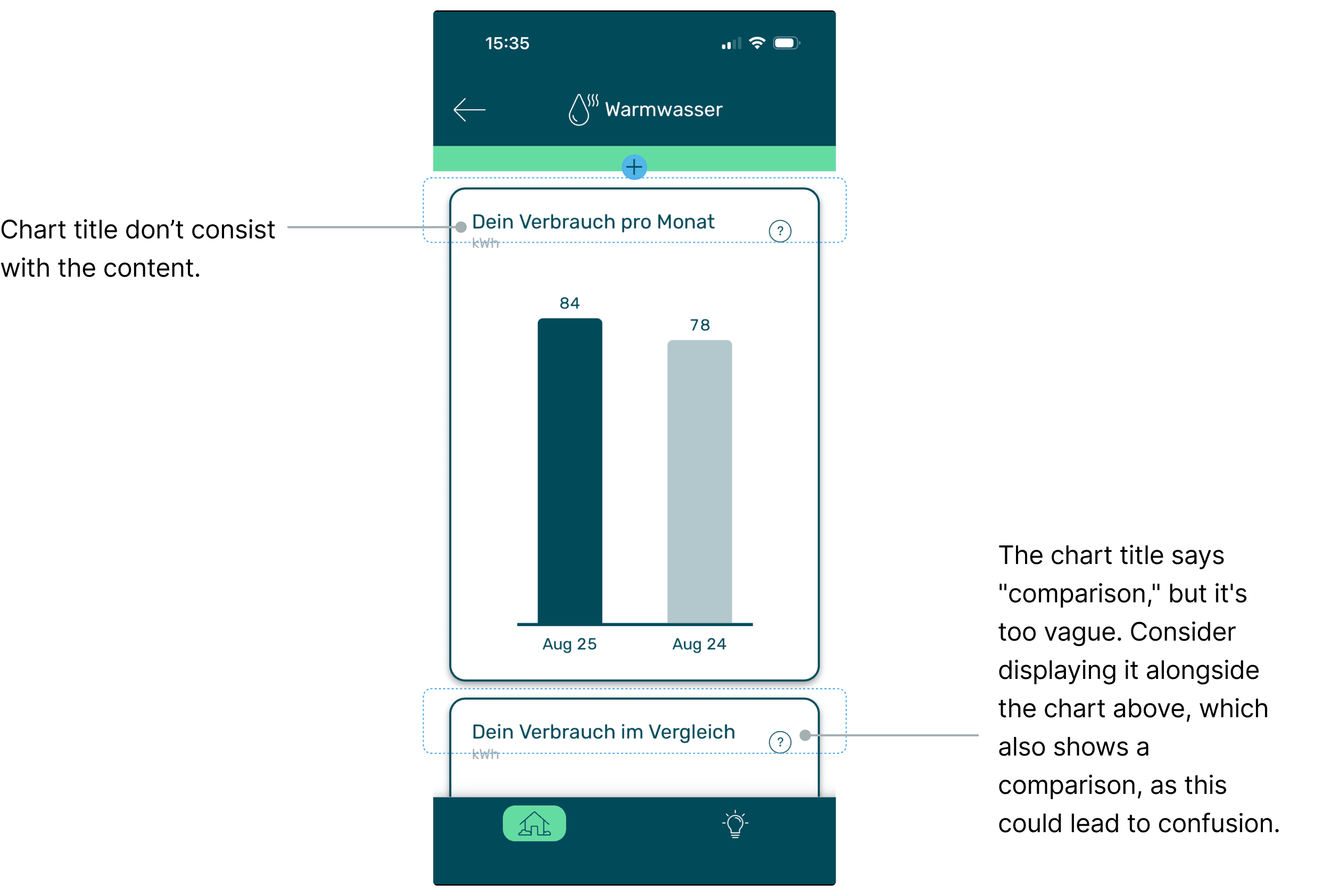
Fragmented comparison logic
Consumption comparisons (current month, last year, other residents) were separated into different sections despite. Users had to switch between screens to understand.
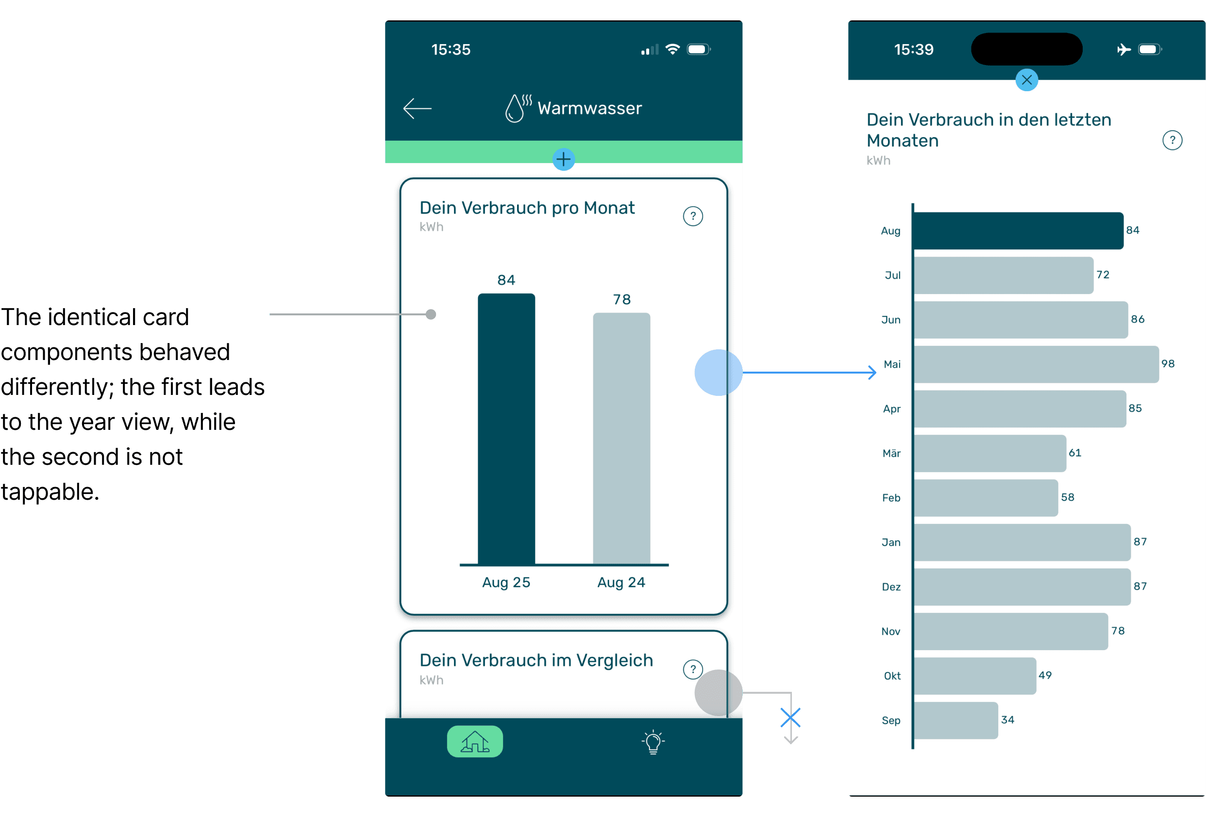
Inconsistent interaction rules
Cards looked identical but behaved differently. This made essential functions difficult to discover.
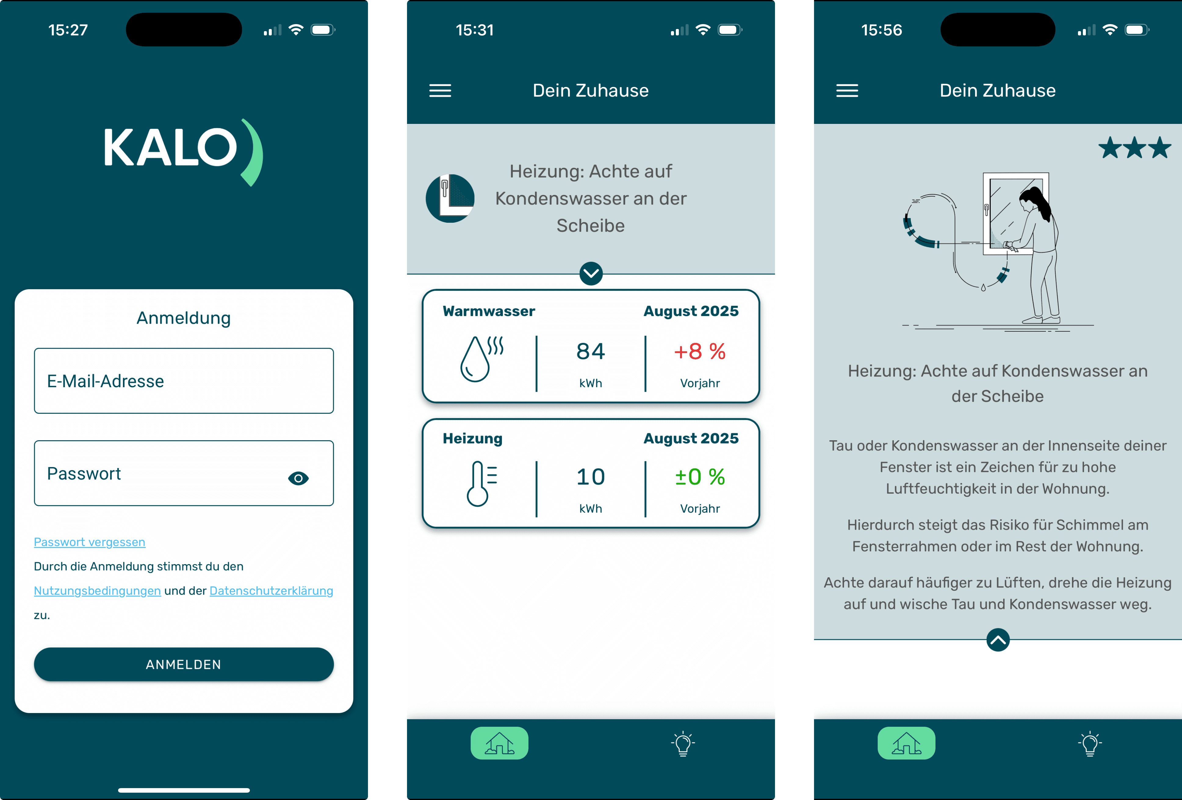
The current Kalo iOS customer app
Understanding the problem
Understand how consumption data was presented and what user‘s needs the app needed to support.
I started with mapping the existing structure. Since the app only updates once a month, users interact in short and need answers to three fundamental questions: 1. What is my consumption this month? 2. How does it compare to last year or other residents? 3. How do trends evolve across the year? The current homepage displayed only the latest month for warm-water and heating, while „yearly trends“ and „comparative insights“ were buried within disconnected screens. Clarifying the hierarchy became the first priority.
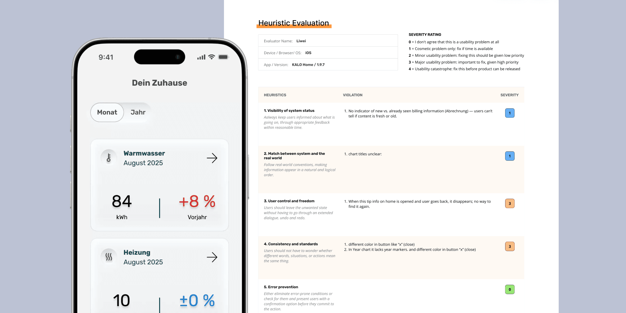
Heuristic Evaluation
Identifying Pain Points
I ran a heuristic evaluation to identify additional usability gaps. Three dominant forms of cognitive load emerged: • Navigation load: conflicting navigation systems made feature discovery unpredictable. • Interpretation load: scattered comparisons made trend reading difficult. • Interaction load: identical components behaved differently, causing trial-and-error usage.

heuristic evaluation Files
Here is the complete document for the heuristic evaluation. Click to
download the Kalo heuristic evaluation file.
Problem Defined
The redesign needed to address logic, hierarchy, interaction, and UI patterns together.
The findings confirmed that the issues were structural rather than visual.
Problem Defined
The redesign needed to address logic, hierarchy, interaction, and UI patterns together.
The findings confirmed that the issues were structural rather than visual.
Problem Defined
The redesign needed to address logic, hierarchy, interaction, and UI patterns together.
The findings confirmed that the issues were structural rather than visual.
Ideation
Rebuilding the Information Architecture
With the clarity of problem and the goals, I focused on redefining structure. I redesigned user flows separately for operators and engineers: dashboards for operators showing key signals at a glance, and structured parameter views for engineers supporting deeper analysis.

Visual Competitor Analysis
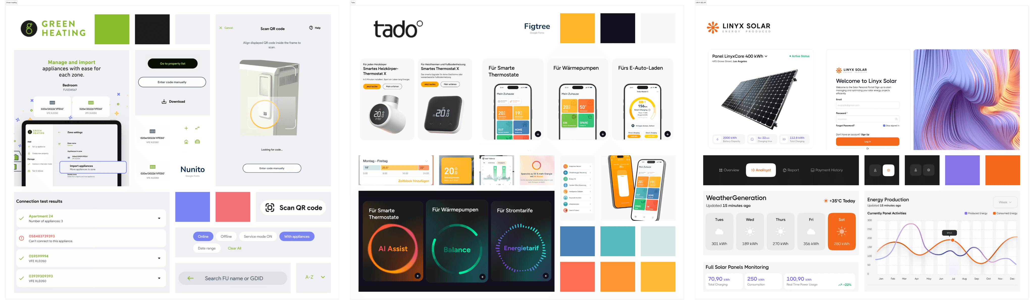
I reviewed similar energy apps from Tado, Green Heating, and smaller providers. They shared two clear characteristics: • clean, predictable visual hierarchy • consistent interaction patterns These insights supported decisions around clarity, rhythm, and component consistency.
Visual Competitor Analysis
I reviewed similar energy apps from Tado, Green Heating, and smaller providers. They shared two clear characteristics: • clean, predictable visual hierarchy • consistent interaction patterns These insights supported decisions around clarity, rhythm, and component consistency.
Final solution
Final solution
Final solution
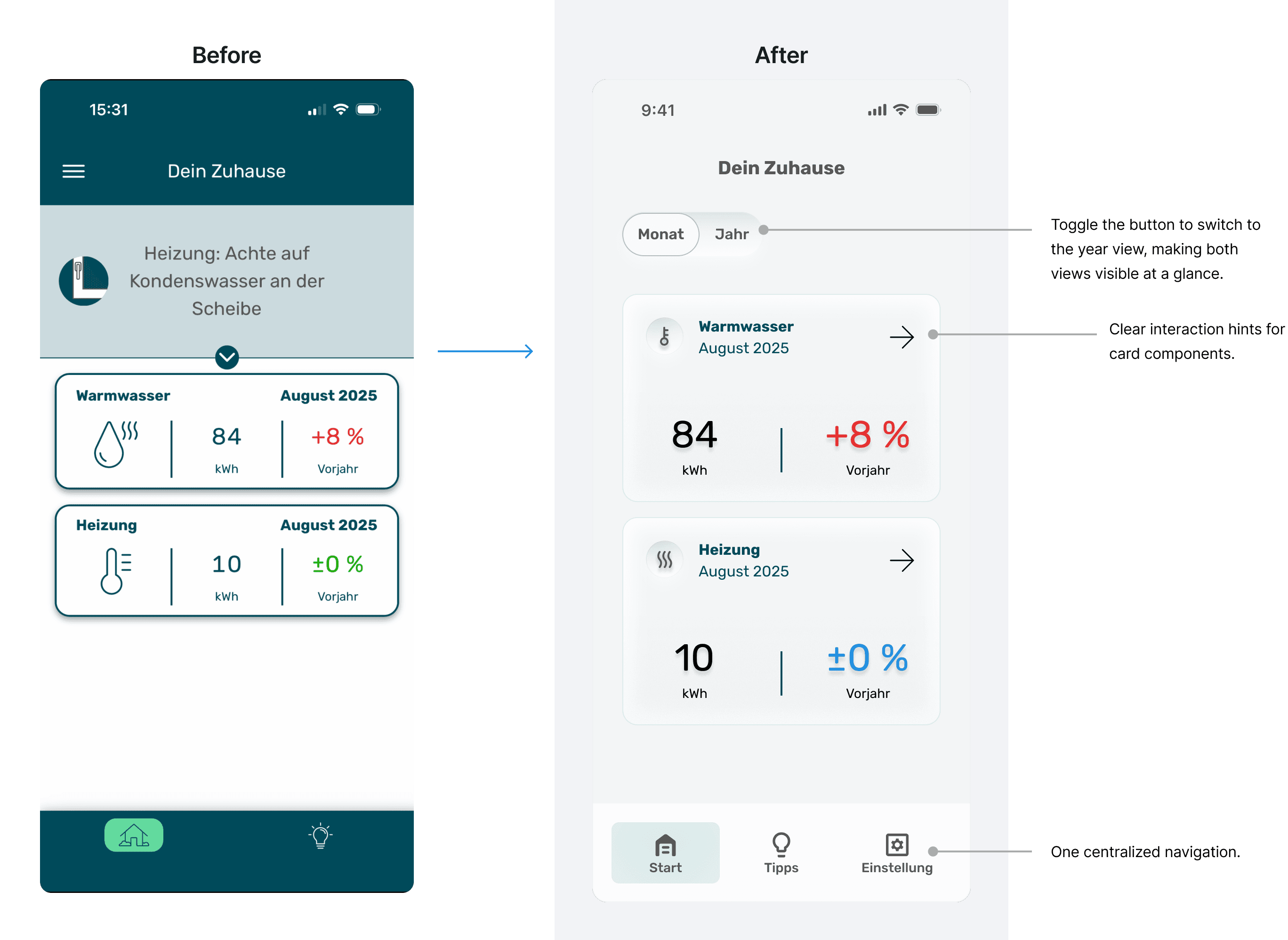
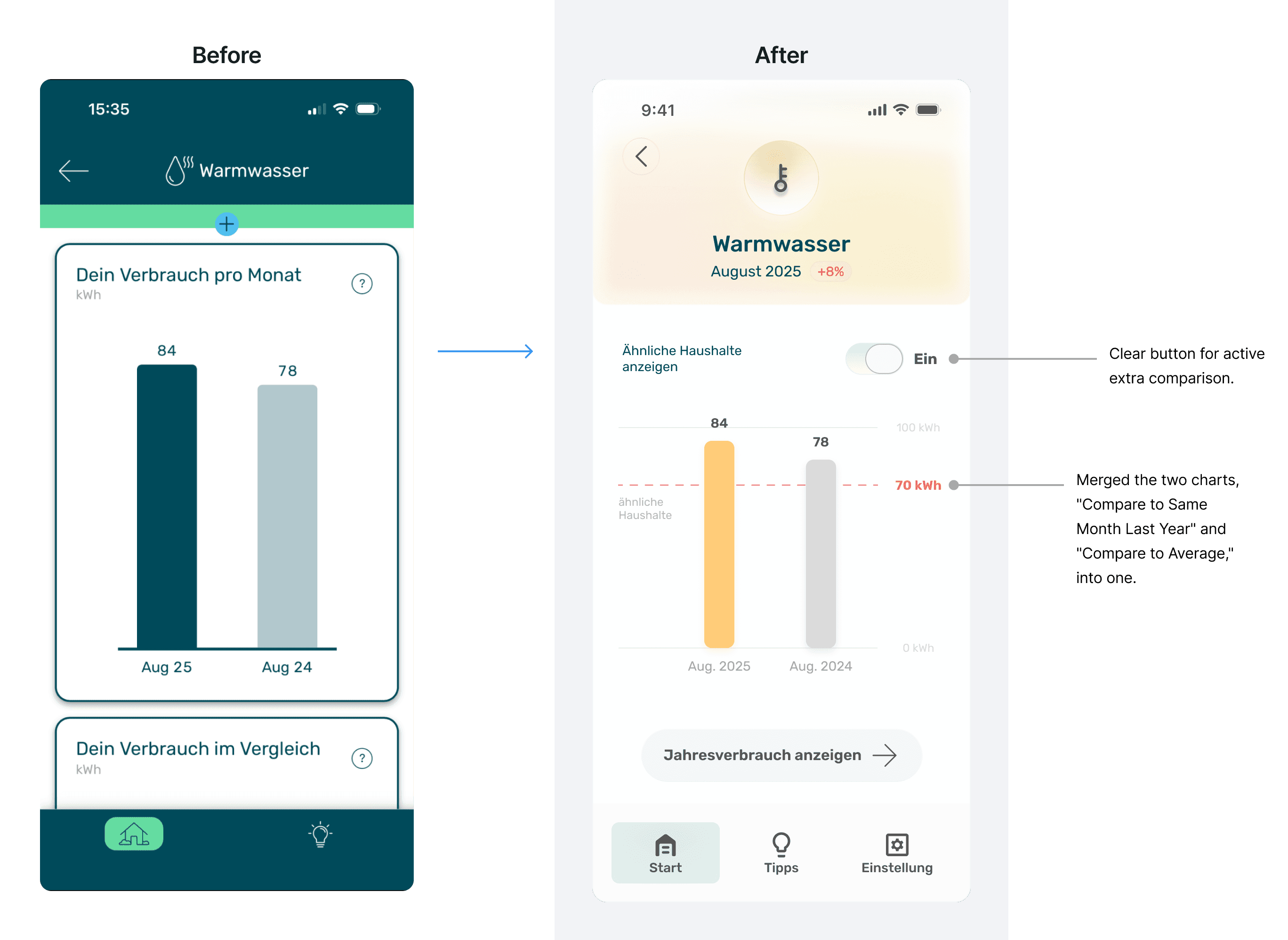
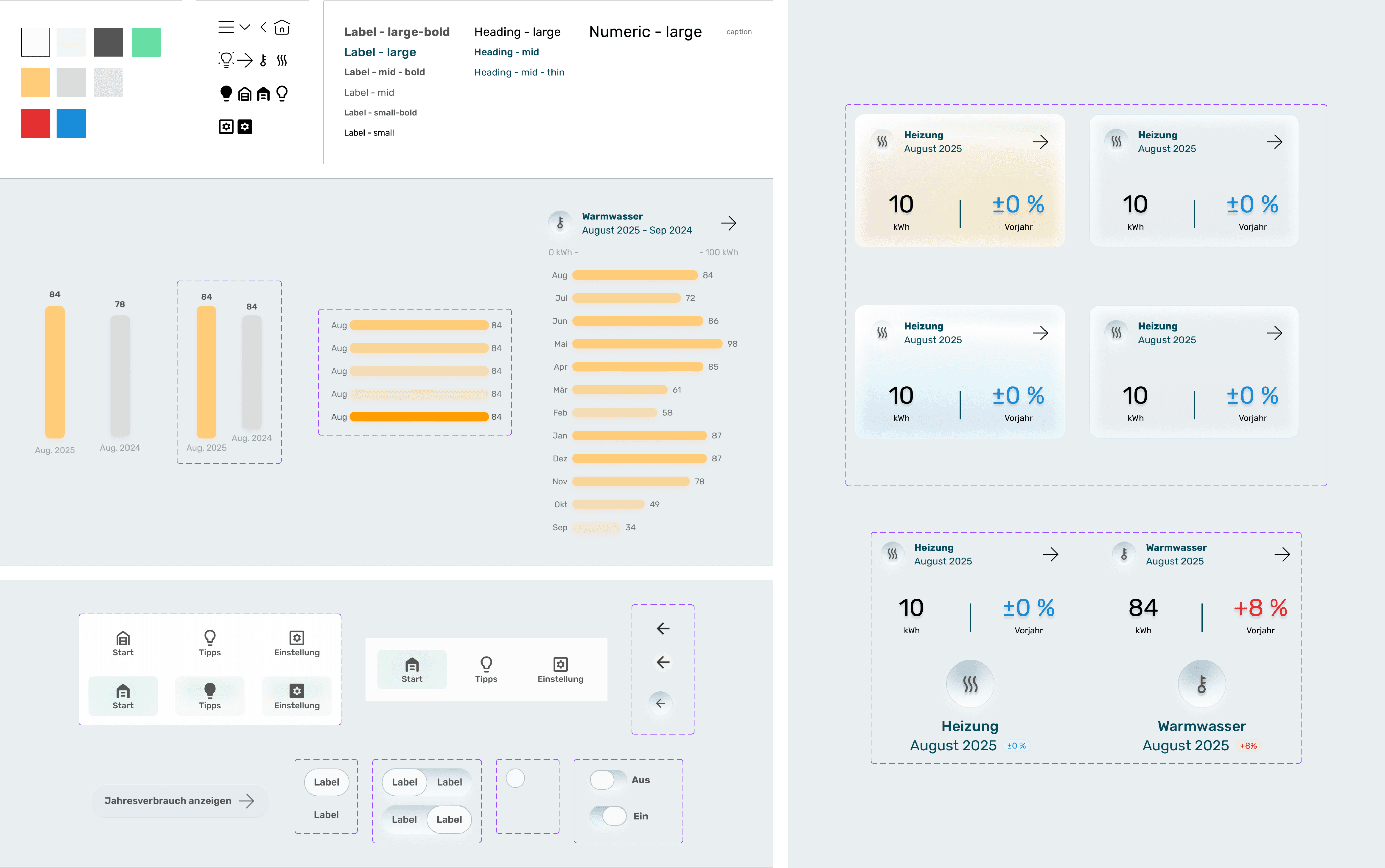
• The monthly value is placed at the Home with refreshed UI and tap-to-view behavior.
• Comparison values follow a consistent color system and labeling.
• Components follow one rule: clickable elements display a clear affordance.
The redesign clarified navigation, aligned user priorities, and modernized the visual language while preserving the professional tone expected in industrial software.
The redesign clarified navigation, aligned user priorities, and modernized the visual language while preserving the professional tone expected in industrial software.
The redesign clarified navigation, aligned user priorities, and modernized the visual language while preserving the professional tone expected in industrial software.
Atomic Design Foundation
I applied atomic design principles to create a scalable component structure and define clear relationships between layout, components, and styling. This provides a foundation for future iterations.
Atomic Design Foundation
I applied atomic design principles to create a scalable component structure and define clear relationships between layout, components, and styling. This provides a foundation for future iterations.
Atomic Design Foundation
I applied atomic design principles to create a scalable component structure and define clear relationships between layout, components, and styling. This provides a foundation for future iterations.
Outcome & Reflection
The redesign makes the experience clearer, more consistent, and more usable. Users can switch between monthly and yearly views more quickly and rely on visual cues that align with the app’s behavior. The interface now presents a coherent narrative instead of isolated data points. During critique sessions, I received feedback on two areas: • some text sizes were too small • the neuromorphic-inspired style reduced contrast in certain components The muted gradient style was intentional, but future iterations would focus on contrast and accessibility improvements. This one-week design sprint focused on building the atomic design system and redesigning four main screens. With more time, I would conduct usability testing, refine accessibility, and expand the component library.
Get in touch
Get in touch
Work with Liwei to make your product more thoughtful and easier to use.
Work with Liwei to make your product more thoughtful and easier to use.
Liweiworks
Liweiworks
© liweiworks.com All rights reserved
© liweiworks.com All rights reserved