DeepFlow — A Deep-Working Timer App for Deep-Work Professionals

Time

2-week design sprint

Role

Product Designer

Team

Solo project

Focus

UX Research,

Usability testing,

Mobile design,

Overview

Research

Ideation

Final Product

Reflection

Overview

The Pomodoro technique is one of the most widely adopted productivity methods, designed around fixed work and rest cycles.

While effective for many, I noticed that Pmodoro timer often fails for deep-work professionals, people who rely on long, uninterrupted sessions such as designers, researchers, writers, and students. Through my own freelance work, studies, and conversations with peers, I observed a recurring pattern. Deep focus often emerges naturally, but existing tools interrupt it in the name of enforced breaks and rigid cycles. This project started as a zero-to-one exploration during the Ironhack Bootcamp, using lived friction as an entry point and UX methods to using lived friction as an entry point and UX methods to guide design decisions.

Why design matters

Many focus tools optimize for control, but deep-work users need awareness without interruption.

Who the project is for

The primary audience is deep-work professionals managing long-term, self-directed projects, relying primarily on internal motivation.

How I approached

Use UX research to challenge assumptions and translate insights into a minimal, system-driven interaction model.

Goals

Design a focus tool that supports deep work without interruption, helping users stay aware of time without pressure.

Understanding the Problem

“Pomodoro apps interrupt deep work rather than supporting it.”

Productivity tools are popular and diverse, yet many users cycle between trying new methods and abandoning them over time. To understand why, I focused on deep-work professionals managing long-term, self-directed projects, people who lack short-term external deadlines and rely heavily on internal motivation.

Quantitative Research

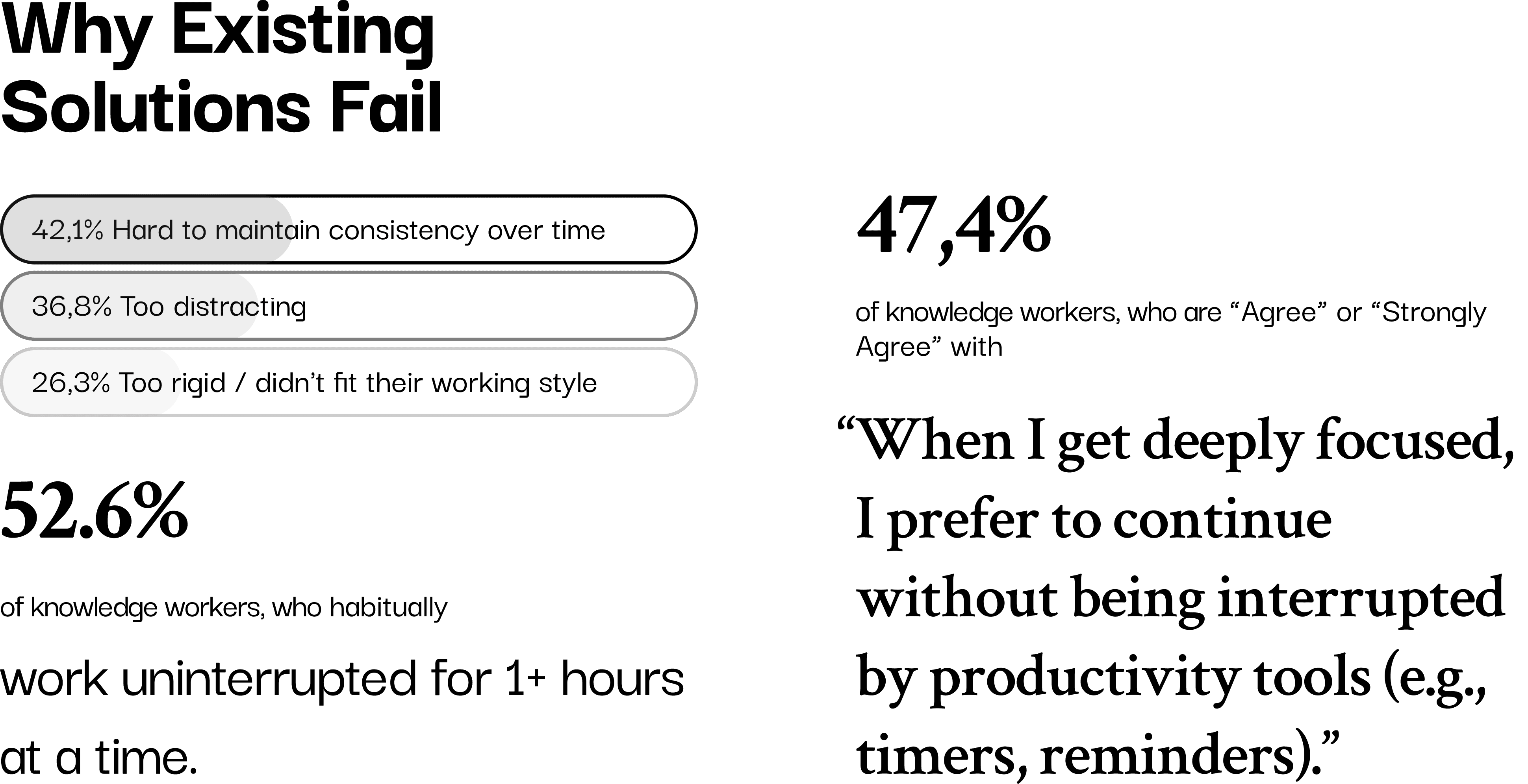
19 valid responses out of 24 survey participants (knowledge workers)

The survey aimed to validate common struggles around long sessions, losing track of time, and difficulty maintaining tools over time. Since this was a niche user group and access was limited, I shifted toward fewer, deeper interviews to strengthen insight quality rather than scale.

Qualitative Research

4 interviews with 3 PhD candidates, 1 freelancer. Here are some insights that guided the direction:

  • Fixed interval often creates resistance rather than support.

“Pomodoro feels like the morning alarm on a phone… it interrupts you in the middle — kind of annoying, an unnecessary action.”

  • Fixed interruptions feel disruptive once users enter flow

“A single notification or even just thinking about lunch can pull me out of focus. Once I lose that flow, it’s so hard to climb back into that deep working mode.”

  • Long, uninterrupted work can feel productive but is not always healthy

“The times when I felt really productive were when I worked for 3 or 4 hours without noticing the time passing or pausing. But I don’t think that’s healthy. Now I value physical health more. This PhD is a marathon, not a short race.”

  • Recording time and repeated effort creates emotional reassurance of continuity and progress

“Doing self-guided project feels like setting up a street stall, no matter what, I have to show up at my desk. But unlike a real stall, it’s hard to see the daily earnings, no sense of progress. That’s why I rely on recording my hours and tasks, just to prove to myself that I moved forward.”

Challenging Assuptioins

During research, a recurring question challenged my direction:

“If people want to work freely, why do they still need reminders at all?”

Interviews revealed that uninterrupted deep focus and time awareness are not opposites, users want freedom in the moment, but reminders to sustain long-term health and progress.

The challenge was not choosing one over the other, but supporting time awareness without interrupting deep focus, and reflection without pressure.

Persona & User journey map

From insights to framing the challenge

I created a persona and journey map to synthesize patterns across interviews and surface recurring frictions. This helped clarify the real design challenge: People adopt productivity tools to gain structure, yet abandon them once those tools misfit or interrupt their natural rhythm.

Key learnings

Problem is not motivation or discipline. Problem is how tools handle time awareness during deep focus.

Problem Statement

Deep-work professionals managing long-term projects need to sustain deep focus while maintaining awareness of time and progress.

Existing productivity tools often disrupt flow and rely on evaluative feedback that becomes demotivating over time.

Problem Statement

Deep-work professionals managing long-term projects need to sustain deep focus while maintaining awareness of time and progress.

Existing productivity tools often disrupt flow and rely on evaluative feedback that becomes demotivating over time.

Problem Statement

Deep-work professionals managing long-term projects need to sustain deep focus while maintaining awareness of time and progress.

Existing productivity tools often disrupt flow and rely on evaluative feedback that becomes demotivating over time.

Design Objectives

The product should not control the user’s rhythm. It should observe, reflect, and support awareness without authority or pressure.

The ideal tool should help users maintain awareness of time while feeling in control of their own rhythm. I focused on four guiding concepts. Combining them helped ensure that design decisions were grounded in research insights, not personal preference or visual trends.

Autonomy Timer

Users decide when to start and stop, not the system.

Awareness Countdown Timer

Time should be visible without demanding attention.

Emotion Design for Reflection

Feedback should reduce guilt and support continuity, not evaluate performance.

Minimal Interaction Design

One or two core interactions that feel intuitive and emotionally low-friction.

System Logic and Information Flow

Early ideation explored combining three time concepts into one system: session focus, background awareness, and daily reflection.

System Logic and Information Flow

Early ideation explored combining three time concepts into one system: session focus, background awareness, and daily reflection.

System Logic and Information Flow

Early ideation explored combining three time concepts into one system: session focus, background awareness, and daily reflection.

Information flow refined

The core challenge was not adding timers, but separating different meanings of time so they would not compete for attention. I chose to design system logic and information flow before lo-fi wireframes, clarifying what should run automatically, what required user input, and how different time layers interact.

Early Prototyping & Testing

Based on the user flow, I created the lo-fi prototypes. I tested both concepts and prototypes with 3 users, focusing on both usability and emotional response.

Early Prototyping & Testing

Based on the user flow, I created the lo-fi prototypes. I tested both concepts and prototypes with 3 users, focusing on both usability and emotional response.

Early Prototyping & Testing

Based on the user flow, I created the lo-fi prototypes. I tested both concepts and prototypes with 3 users, focusing on both usability and emotional response.

Mid-fi testing

Key learnings

• The concept was understandable

• Multiple time indicators felt visually overwhelming

• Verbal explanation was often required, signaling excessive cognitive load

The issue was not the idea itself, but presenting multiple meanings of time simultaneously.

Iteration

To resolve the issue from testing, I separated time into distinct interaction areas inside one screen. Each area serves a different purpose and uses its own visual solution, so users can intuitively understand what matters now, what runs in the background, and what is meant for later reflection.

Key Refinements

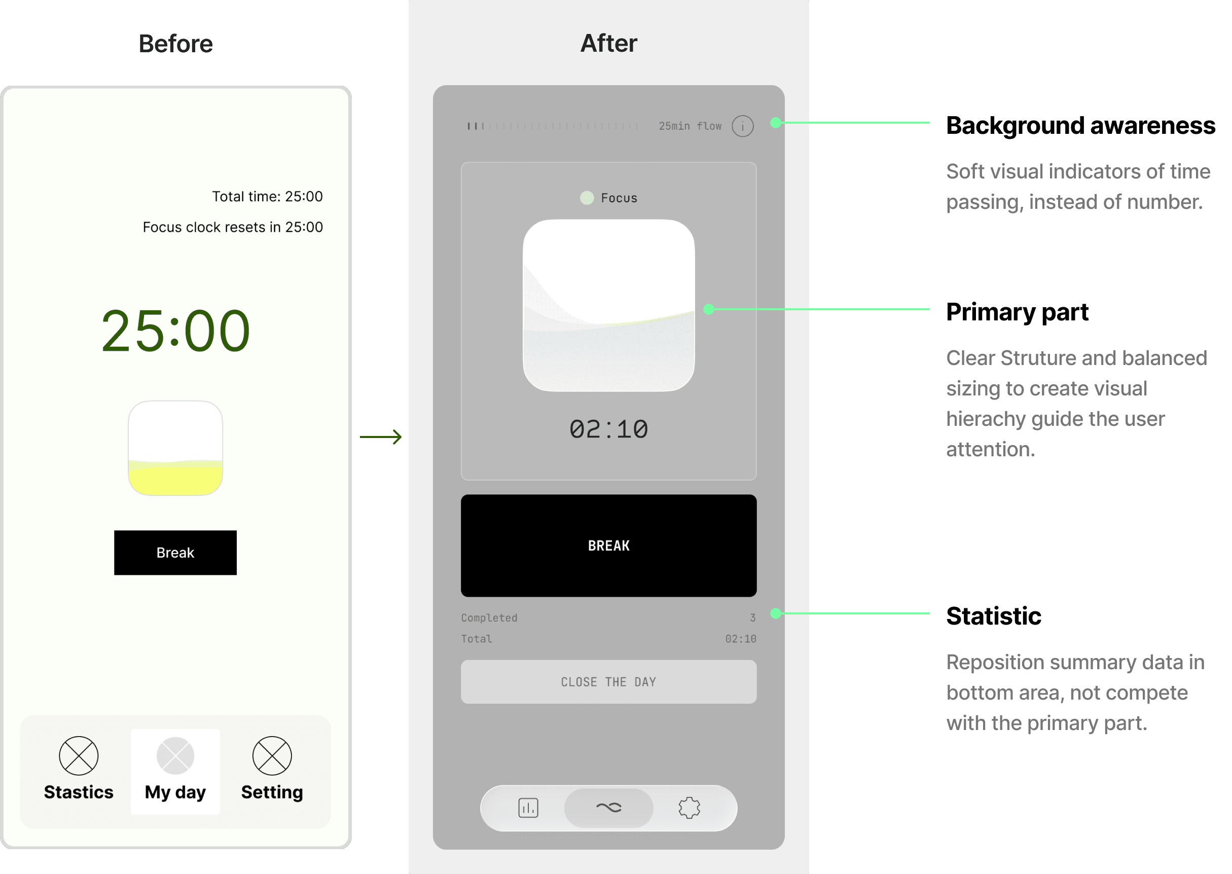
Tradeoff: Minimalism vs Usability

I initially aimed for strict minimalism. However when testing showed that users needed clear pause and reset actions to feel safe and in control. After comparing both variants, I chose to add these action buttons, making the system less rigid while preserving its core simplicity.
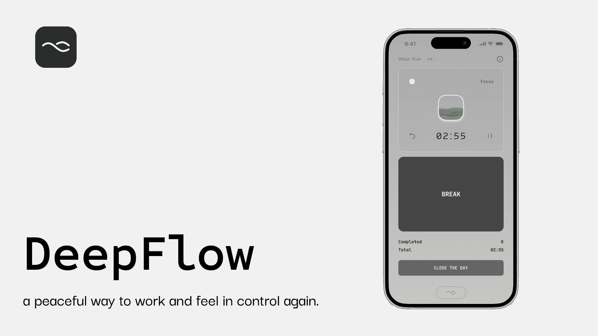
Final solution

The final design emphasizes calm focus and minimal interaction, using large, clear primary actions, neutral colors with soft gradients, and minimal contrast shifts to reduce visual noise and support sustained attention.

Final solution

The final design emphasizes calm focus and minimal interaction, using large, clear primary actions, neutral colors with soft gradients, and minimal contrast shifts to reduce visual noise and support sustained attention.

Final solution

The final design emphasizes calm focus and minimal interaction, using large, clear primary actions, neutral colors with soft gradients, and minimal contrast shifts to reduce visual noise and support sustained attention.

Start Focus

One tap begins a focus session. The timer runs quietly in the background with a calm rhythm indicator.

Gentle reminders

A soft countdown reminder appears at the top. When it ends, the session continues automatically. Users can stay in flow or switch to a break without interruption.

Deep Focus mode

If users continue working after the reminder, the session naturally shifts into Deep Focus mode, with the rhythm indicator changing to reflect sustained focus. The countdown resets, allowing users to keep working in their own rhythm without additional actions.

Emotional visual reflection

Users see a visual summary of focus, deep work, and breaks, with layered visuals reflecting rhythm and continuity rather than performance. Daily, weekly, and monthly views highlight patterns over time, while blank days are treated as meaningful pauses, reinforcing awareness without pressure and progress users can feel.

Testing and Validation

After finalizing the UI, I conducted additional prototype testing to validate comprehension, emotional tone, and cognitive load. Users described the interface as calm and seamless: “It feels like it blends into my workflow.” This confirmed that the UX-driven UI achieved its intended goal of staying present without demanding attention.

Reflection & Next Steps

In this solo project, I was able to tightly integrate UX and UI, ensuring every decision served the same goal: • Supporting natural rhythm creates more sustainable habits than strict systems. • Minimal interfaces often hide complex system decisions. • One-click interactions require careful thinking about invisible dependencies. As a next step, I plan to implement the concept using vibe-coding tools to explore real-world usage and gather longer-term feedback.

Get in touch

Get in touch

Work with Liwei to make your product more thoughtful and easier to use.

Work with Liwei to make your product more thoughtful and easier to use.

Liweiworks

Liweiworks

© liweiworks.com All rights reserved

© liweiworks.com All rights reserved